digital art by teresa lunt
digital artdigital artdigital artdigital artdigital art

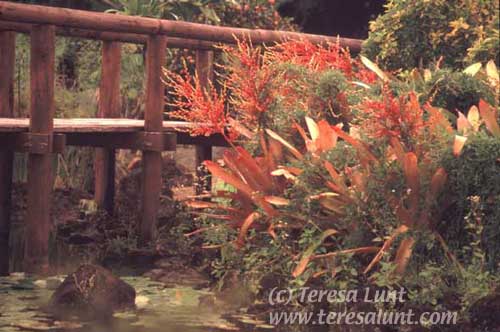
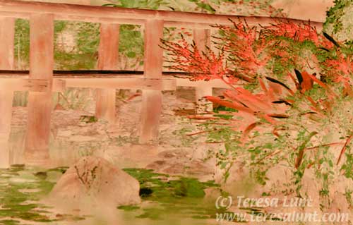
Tutorial 2: Bridge and Lilypads

In Tutorial 1 I showed you how to turn an ordinary photograph into a painterly version of that photograph. But the power of our digital tools allows us to get much more creative than that. Here I will talk about how we can completely transform a photograph into something quite different. The viewer may be surprised to know the work is actually a manipulated photograph! From this example you can get an idea of the variety of art you can create using these tools.

Unlike painting or printing, you do not have to commit yourself with each change or brushstroke you make. The tools we will use allow us to try many things and still return to our original image. I often create several very different versions of an image. Such freedom is not possible with traditional methods.

The picture we will work with here started out as a 35mm color slide on Fuji Provia 100 film. The image was taken in Hawaii, on the Big Island, at the Nani Mau botanical garden. For the scan I used my Minolta Dimage Scan Speed slide scanner.

The scan is at 2400 dpi. (You should scan at a minimum of 1800dpi for 35mm slides or negatives. You can scan at much lower resolutions for prints.) Figure 1 shows the scan I took of the color slide after making initial exposure corrections in Photoshop to match the slide as closely as possible. You can make these adjustments in any image editing software.

photoshop tutorial
Figure 1

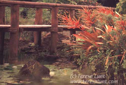
The parts of the image that are interesting to me are the lilypads and rocks in the water, the bridge, and some of the reddish foliage. But there is too much foliage, it looks too visually complex, and it distracts the eye. So I will crop some of it out. I choose my cropping point to keep some of the green bush in the upper right corner, otherwise there would be a black hole there in the corner which might tend to pull the eye.

I wanted to give the lilypads in the lower left more of the image area to emphasize them. So I selected the top two thirds of the image and scaled it down to a half or two thirds of its former height. Then I did the same for the right third of the picture, being careful not to select any of the waterlillies part of the photo to shrink. In Photoshop, you can do this selective shrinking by using the rectangular marquee to select the part of the image you want to shrink, and then using Edit>Transform>Scale to shrink that selection. Now to slightly stretch out the lillypads area of the picture, I selected the entire image (Select > Select All) and used edit>transform>skew to drag the lower right corner just a bit to the right. Do not drag the corner down, or you will lose some of the interesting lilypads part of the image. The result of all this cropping, shrinking, and stretching can be seen in Figure 2.

photoshop tutorial
Figure 2

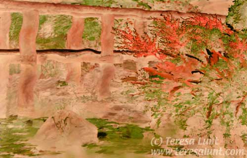
Now compare Figure 2 to the original composition in Figure 1 and you will see that the interesting water part of the image is much more prominent. The compressing that we did also emphasizes the diagonal lines of the red foliage, which is another interesting compositional element. Notice how those red diagonal lines are now at a steeper and more interesting angle.

Now with all the work we have done on the basic composition, this is already an interesting image. But now we are going to work on the color. There is no reason to stick with the actual "real" color or even realistic or plausible color. I want color that is pleasing to look at, that eliminates distractions, and that makes a striking image. Color may be the first thing to draw a viewer to an image.

The first thing I did was to address the washed out greens. Using the Hue/Saturation tool, I selected Yellow, and boosted it toward the green. You can boost the saturation of this color a little bit while you are there. I also decided to slightly increase the saturation of the reds.

Then I decided to lighten up the too-dark shadows under the bridge. I selected an area using the lasso tool, and I feathered the selection by 20 pixels so as to avoid a sharp edge to the selection (select>feather). Then I used "curves" to lighten the selected area somewhat. The results of all these color corrections can be seen in Figure 3. (Figure 3 also shows the results of just a bit more selective shrinking.)

photoshop tutorial
Figure 3

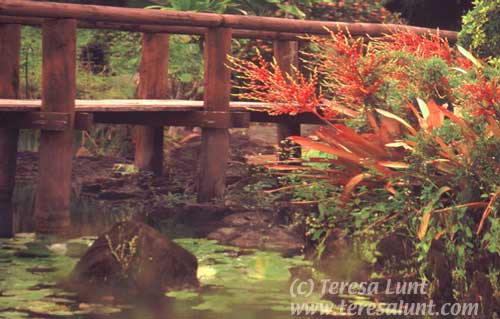
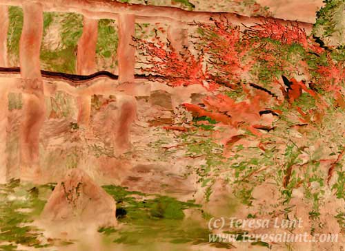
Figure 3 is pleasing, but I was after something more artistic. The image is too literal for me, and overall the image has too many dark areas. I needed some radical alterations. I know that inverting the image will replace dark areas with light areas, while the middle greens and reds will generally keep their same brightness. But inverting a color image also inverts all the colors. I don’t want to invert the colors, so I do the following. .

First I inverted the image. Then I used "fade invert" (from the Filter menu) at 100% opacity using the luminosity blending mode. This preserves the colors of the original, but inverts the light and shadows. You can see this in Figure 4.

photoshop tutorial
Figure 4

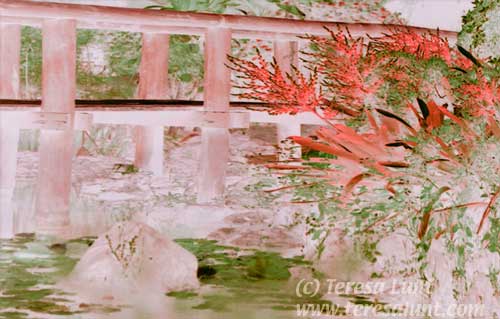
If you compare the original with the final image, you can see that we took a rather ordinary image and made it into a piece of art!Then I experimented with color alterations in Channel Mixer. Channel Mixer can produce extreme and unexpected color changes, so you want to experiment and make small changes to try different effects. Here I used Channel Mixer to boost the red a bit and reduce the green and blue just a bit. I also used the burn tool at a very low opacity to darken the rock and the bridge a bit. Burning also deepens the color in that region. Figure 5 shows the results of the image inversion and color adjustments. Now the image is starting to look something like a woodblock print. The image has been simplified by reducing its color palette to just red and green, and replacing the dark areas with light areas.

photoshop tutorial
Figure 5

Now I wanted to add some interest by introducing distortion. Distortion is one of my favorite effects. I often use it to create an almost hallucinatory feeling. (You can see lots of examples of this at my website.) Here I used a pen input device and Wacom tablet to draw in some distortion. For this I used the Photoshop plug-in software that came with the tablet, specifically the Super Putty tool, to use the pen to push pixels around. I used the smallest stylus setting in that tool to make the most fine-grained effects. The tablet is pressure sensitive, so you can increase the effect by increasing the pressure.

The results of the pen work were fine grained. I also wanted to make some larger scale distortions. I felt the lines in the bridge were too straight, so I selected small portions of the image and used filter>distort>twirl on each of them. This allows you to make your distortions look exactly as you want them to look. If instead you were to use a filter to apply a single distortion to the entire image, such as filter>distort>wave, you do not have nearly as much control, and the distortion looks too regular, clueing the viewer in to your methods. Figure 6 shows the distortions I added.

photoshop tutorial
Figure 6

Next I added some finishing touches by deepening shadows and darkening some areas, and highlighting other areas. I also increased the contrast a bit. These kinds of final adjustments can really bring out a feeling of depth in an image.

Finally, I used transform>skew to pull the top left corner a bit out of the picture, and then filter>distort>pinch to select the area under the bridge to shrink it. The thing I do last is to use filter>unsharp mask to sharpen up the details. When I was all done I decided to de-emphasize the left side of the picture by shrinking it. You can see the final image in Figure 7.

photoshop tutorial
Figure 7

If you compare the original with the final image, you can see that we took an unremarkable photograph and transformed it into a work of art!

digital art by teresa luntdigital artdigital artdigital art

Send an e-card!
photoshop tutorialphotoshop tutorialphotoshop tutorial