|
|
|
Tutorial 3: Art Deco Clocktower
In Tutorial 2 we transformed an ordinary photo into a dramatically different piece of artwork. While there were many different manipulations involved, the primary tools used to achieve the final effect were to invert the image and to manipulate the color. Here we will do a variation on that technique, and combine it with image distortion for quite a different effect.
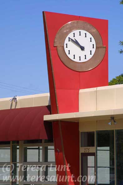
The original image can be seen in Figure 1. It is a photograph of a vacant gas station building in Ashland Oregon. I really liked the art deco feel of this building. I also generally liked the colors and composition. But I wanted to do something to really bring it to life and give it an illustrated or painted, rather than a photographic, quality.
I took this photograph with my Canon D30 digital camera using a 28-135 zoom lens. This particular camera gives a three megapixel, high quality noise-free image. In bright, sunny conditions like this, you can get a high-quality image using any medium to high quality consumer digital camera. Using a digital camera to capture the image means we can avoid the additional step of scanning the image, as we would have to do if we had captured the image on film. Three megapixels is enough resolution for the types of manipulations we are going to do, which will generally have a smoothing effect on the image. Set your camera to save the image in the highest quality jpg or raw mode.
|
|
|
|
 |
| Figure 1 |
|
The first manipulation I did was to straighten the lines using Edit>Transform>Skew in Photoshop. (While I am using Photoshop, most of these same image transformations are available in the other popular image manipulation programs.) Next, I enhanced the colors using Image>Adjust>Hue/Saturation and Image>Adjust>Replace Color. These are steps I generally consider first when developing my vision for the final image. Using skew and the other Edit>Transform tools lets you fine-tune the composition. Using Hue/Saturation and the other color manipulation tools gives you complete control over your color palette and the overall mood of the image. I could have skipped this color step, though, because as you will see, my manipulations will make drastic changes to the color, which I then correct in my last steps.
Because I wanted a painted effect, I used the pen tools that came with my Wacom tablet to paint in brush strokes over the image without changing the colors. These pen tools are Photoshop plug-ins that are automatically installed when you install your Wacom tablet. I use pen input for this step because it feels natural in the hand for drawing and painting. But the brush strokes I made using the pen tools were quite sharp-edged. So I blended this painted version of the image with the unpainted version, to soften up the pen strokes. An alternative to using Photoshop and the Wacom pen tools for this step would be to use ProCreate’s Painter, which gives you many kinds of brushes and paint effects to experiment with. For adding brush strokes without altering the color in Painter, I would use the "water" tools in that program. You can experiment with these different tools to discover which effects you like best.
I wanted to de-emphasize the bottom half of the composition, which consists of the gas station windows. So I selected that portion of the image using the rectangular marqee tool, and then used Edit>Transform>Scale to reduce its size.
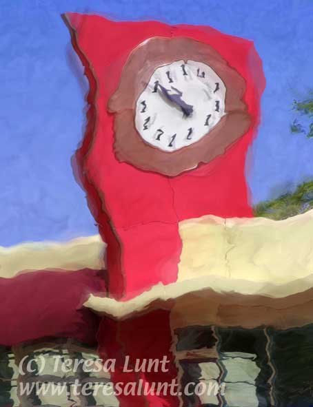
Next I wanted to add some soft distortions. There are a number of Photoshop filters that can be used to distort the image, but the one I use the most is Filter>Distort>Twirl. You can also try Filter>Distort>Wave. These filters allow you to set several different parameter values, and you just have to experiment until you find the settings that work for the image you are working on. For the wave filter, I have recorded in a notebook a number of settings I arrived at experimentally that seem to work on a variety of images. The wave filter is useful when you want to have a uniform distortion, or wave, applied to the entire image. In this image, I applied the wave filter a couple of times with different settings, each time using Filter>Fade afterwards to blend the results with the previous step to soften it. These blended waves are evident in Figure 2.
|
|
|
|
 |
| Figure 2 |
|
But sometimes the result of using the wave filter is too regular, even when you mix many waves of different settings. So often I just use wave for a first overall effect and then do most of the work by making very many local distortions using twirl. Often I don’t use wave at all, in favor of twirl. Using twirl, you can get wavelike distortions, but get very fine-grained control over where to put them and how big they are. Don’t use the twirl filter on the entire image. Instead, select a small portion of the image and apply twirl. Then do this over and over again to different portions of the image until you like what you have. You can get the exact distortion in the precise part of the image you want. You can see the result of twirl combined with all my manipulations so far in Figure 2. I made local distortions using twirl in various parts of the image.
So far so good. But now the sky was still pretty uniformly untextured, even though earlier I had added some pen strokes using the Wacom pen tools. So I used the art history brush to add some paint brush strokes to the sky. This gave the sky an interesting nonphotographic texture. The art history brush has several settings and can be very unpredictable, so you just have to experiment. Alternatively, you could use Procreate’s Painter, which has lots of different types of brushes and paint effects, for this kind of work. And of course, pen input allows you much greater control and a more natural feel than using a mouse, for this kind of brushwork.
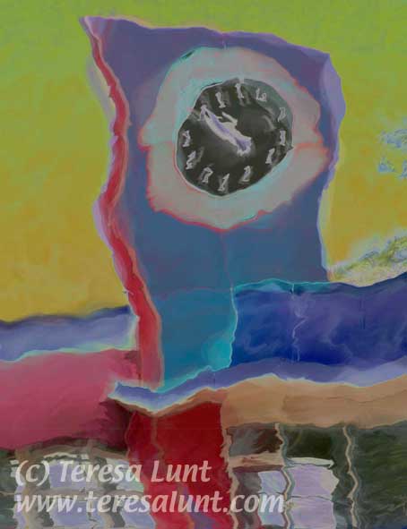
Now I wanted to make some radical color changes. Things to try for radical color changes are Image>Adjust>Invert and Filters>Stylize>Solarize. First I used the solarize filter, which you can see in Figure 3.
|
|
|
|
 |
| Figure 3 |
|
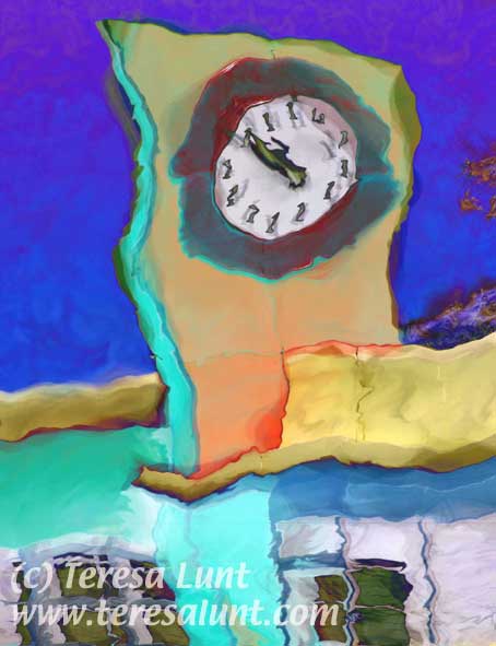
I knew this would turn the clockface black, and would create an overall dark and flat image, which I didn’t want. So then I inverted the solarized image to get back the white clock face. Inverting results in washed out colors, so I used Image>Adjust>Levels to stretch out the color range. You can see the result in Figure 4.
|
|
|
|
 |
| Figure 4 |
|
This gives really lush, vibrant colors, but I wanted to get back some of the original colors. So I made some transformations on the individual colors of the copper ring on the clock of the red clocktower, and of the blue sky. For these color corrections I used Image>Adjust>Hue/Saturation and Image>Adjust>Replace Color on selected portions of the image. You can see the final result in Figure 5.
|
|
|
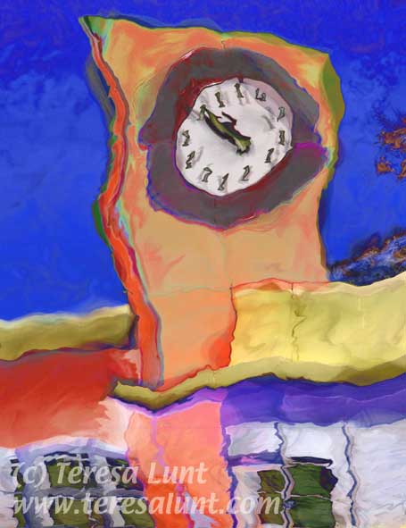 |
| Figure 5 |
|
The final image has real life to it, with colors that leap off the page and lines that seem to move before your eyes. If you compare this to the original image, you can see that we took a straightforward photograph and created something completely different!
|
|
|
|
|

|
|
| Send an e-card! |