|
|
|
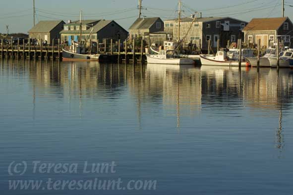
Tutorial 8: Martha's Vineyard We will start with a photograph I took of a fishing harbor on a recent trip to Martha's Vineyard. Figure 1 is the original photograph, taken with my Canon D30 digital camera, of weathered buildings with fishing boats tied alongside. A significant part of the photograph consists of the reflections in the water of the buildings and the boats. What drew me to this photograph were the reflections and the beautifully warm late afternoon sunlight illuminating the boats and the buildings. Reflections are one of my favorite photographic subjects. Yet the image has its problems. It lacks color, being a rather monotone blue. There is a lot of distracting detail in the image, which is not soothing to the eye. Although it was late afternoon, the sun was not yet low enough in the sky to product a really glowing effect. And the focus of the image is not strongly on the reflections and the warm lighting on the buildings, which I feel are the most interesting parts of the image. We will focus our manipulations of this image to correct these problems and to enhance those parts of the image that I find most compelling, namely, the reflections in the water and the warm late-afternoon lighting. What I'd like to do with this image is to make the color more interesting, since there is not a lot of color there besides the overall blue from the sea and the sky. I also want to increase the emphasis on the reflections in the water and the warm glowing light on the boats and buildings. I want to enhance the glowing quality of the light on the buildings and the reflection of that light in the water. In addition, I'd like to remove some detail, to make the image look less photographic and more painterly. We will do all our manipulations in Photoshop. |
|
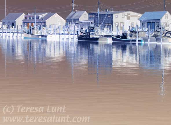
The first thing I did was to use the crop tool to crop a bit off the left edge of the photograph to get rid of some dead space. Then I inverted the image using Image>Adjust>Invert. Inverting the image produces a negative of the original image. You can see the results so far in Figure 2. I chose to invert the image because my experience is that you can bring a lively quality of color to an image by first inverting the image, fading to luminosity mode, and then adjusting the tone and color. So the next thing we will do is to fade to luminosity mode using Filter>Fade at 100% opacity and choosing Luminosity from the pulldown menu in the dialog box that comes up. Fading to luminosity mode returns the original colors that were inverted by doing Image>Adjust>Invert, but leaves the luminosities inverted. In other words, the result of inverting and then fading to luminosity is to make the dark areas light and the light areas dark, while preserving the original colors, so that, for example, blue is still blue. |
|
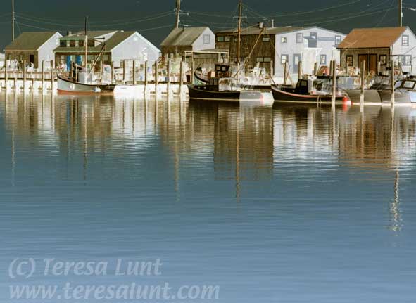
After inverting and fading to luminosity you invariably must darken the image to pull back some color. So our next step is to darken the image using Image>Adjust>Levels. Choose the amount to darken by moving the slider until you like the results. You can see my results so far in Figure 3. One thing I like about this image so far is the nice dark sky we created in place of the washed out one that was there before. |
|
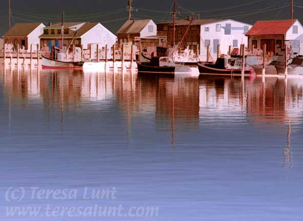
While this image looks interesting, I want to do some color adjustments. There is too much green tone to the buildings and their reflections, the blue looks too cyan and washed out, and there is very little red in the image. A monotone image like this can use a small amount of a bright color like red to add significant interest. So I used Image>Adjust>Channel Mixer to add in some red and punch up the blue. Channel mixer can have unpredictable results and requires a little experimentation to see what results you can get. So it pays to be patient and keep experimenting with this powerful tool. I also used Image>Adjust>Hue/Saturation to increase the overall color saturation of the image and to redden the red hues and deepen the blue hues. I then used Image>Adjust>Color Balance to add a bit of magenta to the highlights and blue to the shadows, which also adds additional contrast to the image. Now I used the Buzz simplifier filter to simplify the image by removing some of the detail. Buzz is a Photoshop plug-in that is also available under the name PhotoArtMaster as a stand-alone program. Buzz removes detail from the image without blurring. It keeps the sharpness of lines and simplifies blocks of color to give a more painterly effect. It also allows you to dial back in a selective amount of small detail to keep the image looking realistic. The amount of simplification I chose to use is subtle, yet it makes the image easier to look at, with a less cluttered feel. The simplification also helps to focus the viewer on main subject of the image. You can see the results of both the color adjustments and the image simplification in Figure 4. |
|
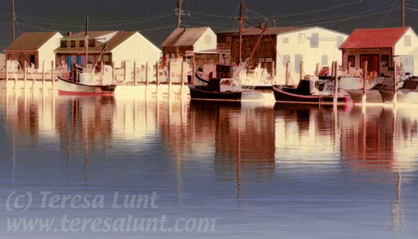
Next I want to enhance the quality of light to bring back and even exaggerate the feeling of warm late afternoon sunlight on the boats and buildings. To do this, I added a diffuse yellow glow to the image highlights. In order to do this I first selected a warm but light yellow color as the background color, using the color picker. This is the color that will represent the glow of the sun on the sides of the buildings. I chose a color of yellow that is not necessarily realistic but that lends a warm feeling to the image and provides a nice degree of color contrast. Then I used Filter>Distort>Diffuse Glow, which adds the background color as a diffuse glow to the light portions of the image. In this filter I always set the graininess to zero. You can try experimenting with the other two sliders for this filter. After applying the Diffuse Glow filter, I used Filter>Fade to fade the effect until it looked the way I wanted. Using Filter>Fade is a good way to get rid of some of the glow if you overdid it in the Diffuse Glow filter. Now, to focus the viewer's eye more firmly on the glow and the reflections, I cropped the image to emphasize these aspects. You can see the final result in Figure 5. |
|
You can see that the final image, is no longer a photographic or realistic rendering of the scene as it appeared in the original photograph. A great deal of detail has been removed and an exaggerated yellow glowing light has been applied to the sides of the buildings and their reflections in the water. The addition of red that appears in one of the roofs and in accents on the boats provides a needed counterpoint to the large expanses of blue in the water and sky. This combination of enhancements lends a very painterly feeling to the final image. |
![]()
